Custom Product Designer
How to Customize a Product in Designer
Introduction
Ezydesigner Tool gives you the freedom to create and personalize products exactly how you envision them. With an intuitive drag-and-drop interface, you can:
- Add and edit text
- Upload/edit images
- Choose from pre-made templates and page layouts
- Adjust font and background colors
- Preview your design before ordering, etc.
Step-by-Step Guide to Using the Designer
1. Open the Designer
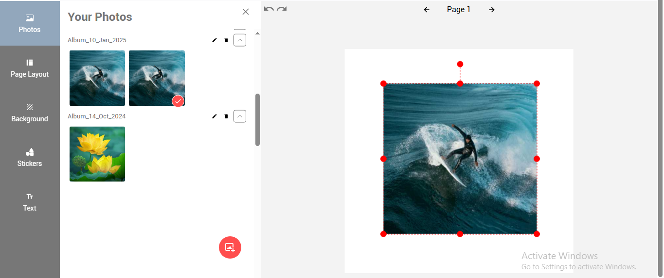
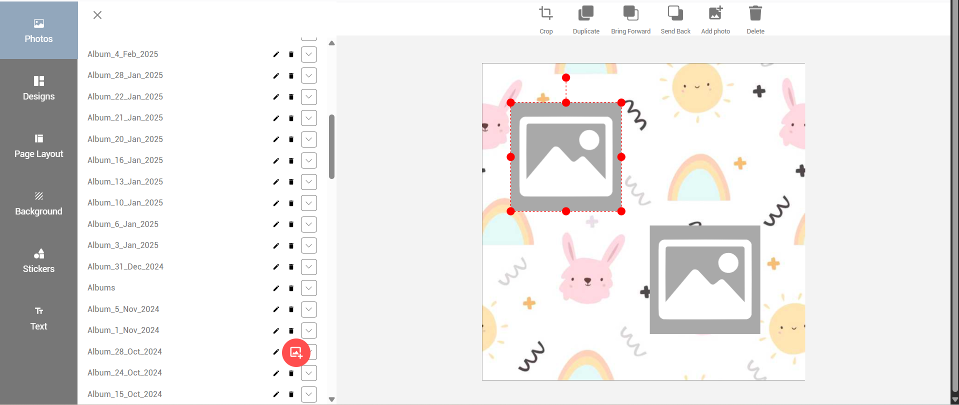
- Click and open the Photo tab.
2. Upload Photos
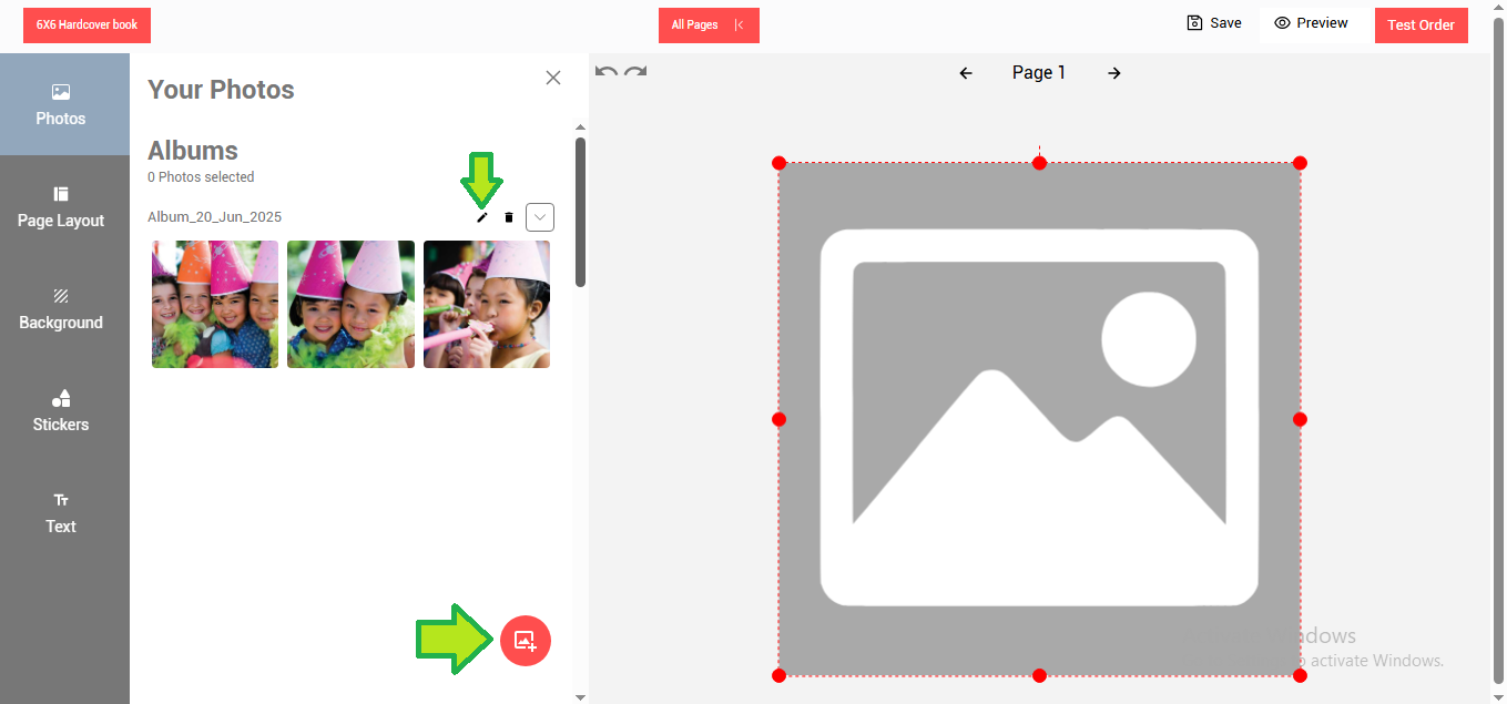
-
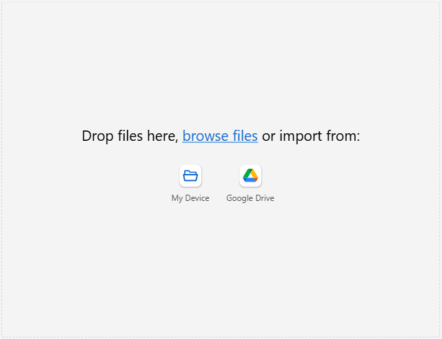
Click on the Upload Photo button.
-
Drag and drop photos directly or browse from your device to add.
-
You can also add photos from your Google Drive.
-
The uploaded photos will appear under created albums.
-
Use the album edit button to edit album details.
-
Click on a photo to add it to the design area.
3. Apply Page Layouts
-
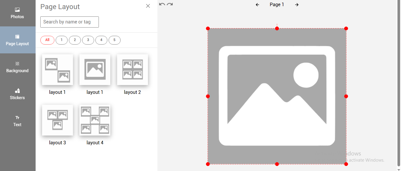
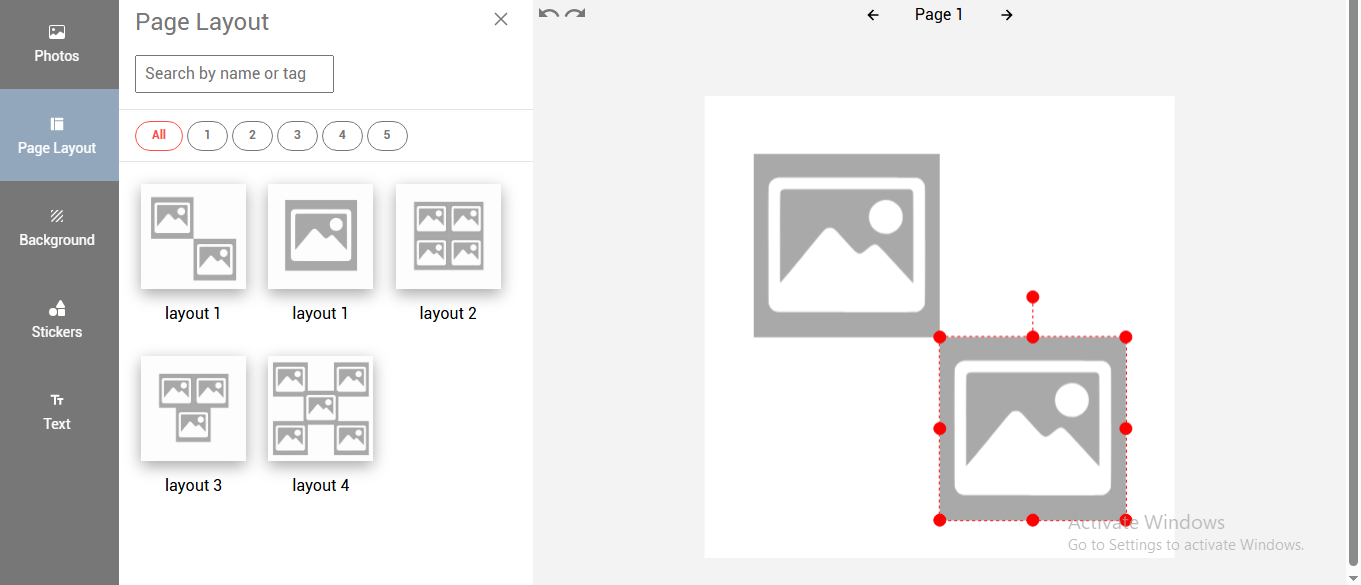
Open the Page Layout tab to see available ready-made layouts.
-
Click on any layout to apply it to your design.
4. Use Gridlines for Alignment

- Gridlines are provided to align two or more photo holders, text fields etc. when the photo/text/clipart field is moved in towards the other photo holder/text/clipart objects. The gridlines appear automatically to make it easier to align with other objects.
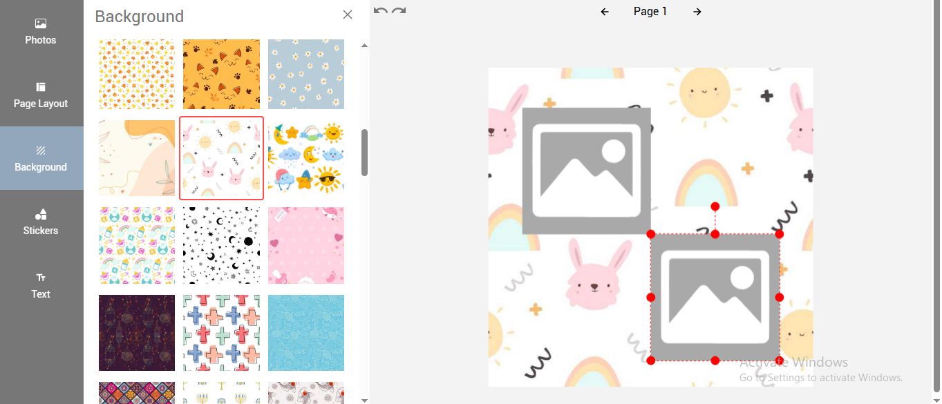
5. Set Background
-
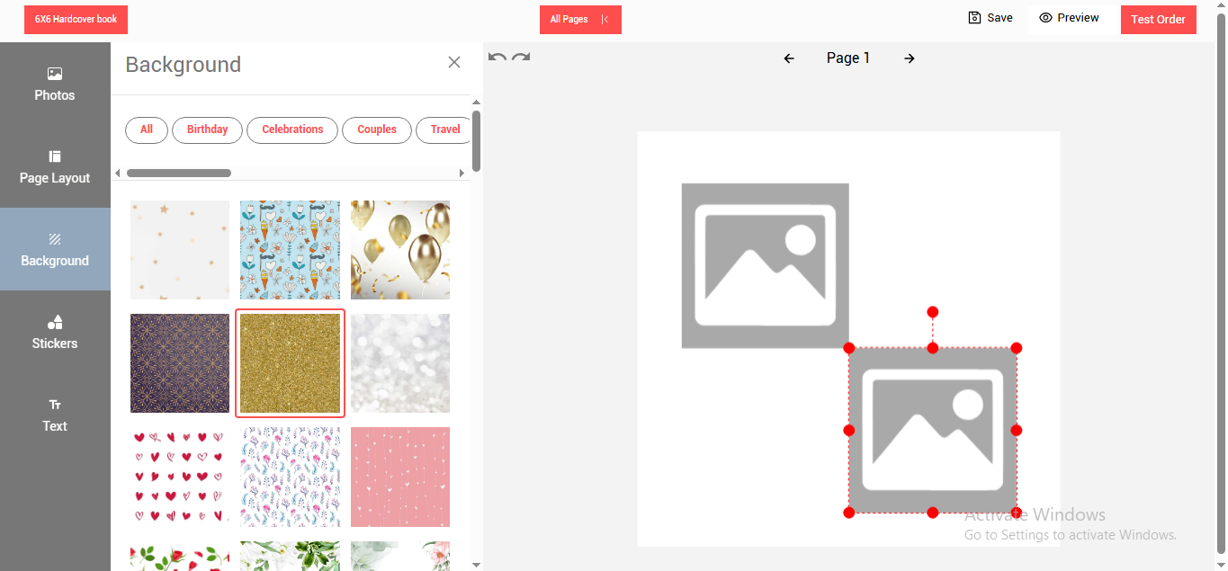
Click on the background tab to display the available background images.
-
Select and click on any of the background images and it will get applied to the designer.
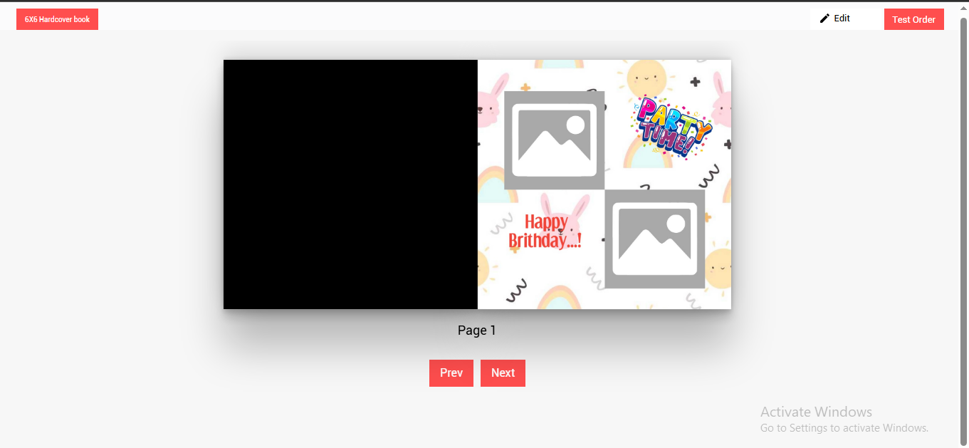
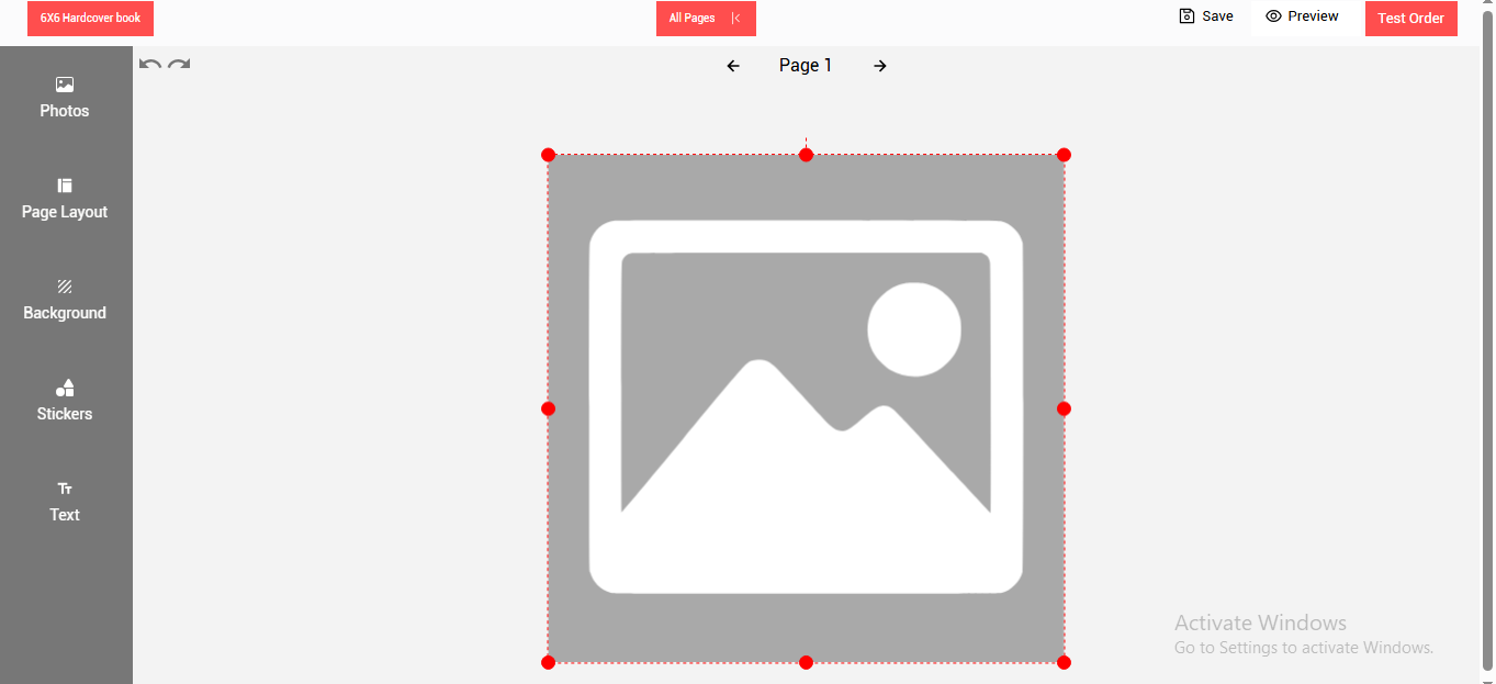
6. Work Area Overview
- The Center part of the designer is a work area.
- The work area will contain a full image displayed when the designer is invoked for the first time.
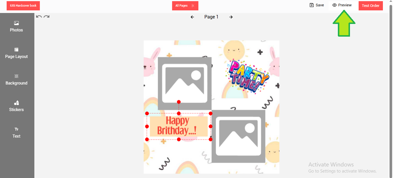
- The red dots on the image are the handles that can be used to resize the image as required.
- Red dots on the image are resize handles you can use to adjust the image size.
7. Toolbar for Photo Editing

- Duplicate: Creates a copy of the selected photo.
- Bring Forward: Photos or text can be arranged one above the other using the Bring Forward button.
- **Send Back:**Works similar to Bring Forward and sends the photo/text holder behind.
- Crop: use Crop to edit a photo, you can crop a portion and remove unnecessary parts of the photo.
- Add Photo: Allow to add a photo holder.you can select and drop an image on it.
- Delete: Delete the selected photo holder.
- Resize & Rotate: You can resize and rotate added stickers as desired.
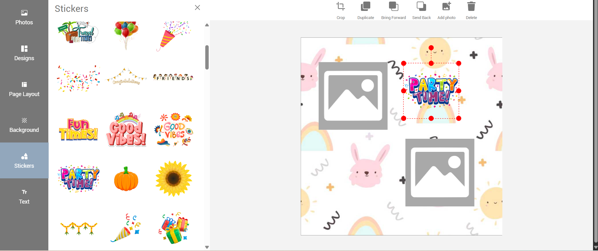
8. Toolbar for Clipart Editing
-
Stickers : The added stickers can be resized, rotated as desired
-
Duplicate: Creates a copy of the selected clipart.
-
Bring Forward: Clipart can be arranged one above the other using the Bring Forward button.
-
Send Back: Works similar to Bring Forward and sends the clipart behind.
-
Crop: use Crop to edit a photo, you can crop a portion and remove unnecessary parts of the clipart.
-
Add Photo: Allow to add a photo holder.you can select and drop an image on it.
9. Add and Edit Text
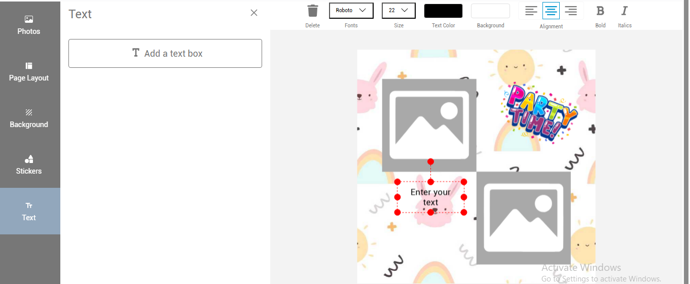
- To add a text click on the text tab.
- Click on the add a text box button.
- Click within the added text field and type in the text. or copy paste a ready text.
- Use the text edit menu to make changes to the added text.
10. Text Editing Tools

- Delete: Removes the selected text field.
- Duplicate: Copies the selected text.
- Bring Forward: Moves the text above other elements.
- Send Back: Sends the text behind other items.
- Font & Size: Choose from available font options and set the font size.
- Text Color & Background: Select from pre-set text and background color options. (Custom color picker is coming in the next version.)
- Text Alignment: Align text left, center, or right.
- Bold/Italic: The text can be changed to bold or Italic by toggling these buttons
11. Final Steps
-
Once the designing is done click on the save button to save the design.
-
Click on the preview button.