How to Create an EzyDesigner Calendar Template?
Introduction
Calendar Template Creator allows users to easily design custom calendar templates. These templates come with pre-designed date pad layouts, fonts, and color options, which users can personalize by adjusting text styles, colors, and event collections. With an easy-to-use design, this tool makes it simple to create professional-looking calendars without any design experience.
The calendar templates you create here will be used by customers in the EzyDesigner to customize and order printed calendars.
Index
Sr. No | Section
1 | Calendar Template Creator Features
2 | How to Create a Calendar Template
3 | How to create events and collection
Features that EzyDesigner Calendar Template Creator offers:
- Access pre-designed templates in the dashboard to jumpstart your design process.
- Add multilingual events.
- Customize templates with calendar date pads, text, images & other design elements for various occasions.
- Design by selecting predefined place holders.
- Add background color and color to text.
- Edit an existing template that is unpublished.
- Preview the design in 2D view.
- A filter option to search the Template name occasions wise, language-wise, published.
Glossary
Photoholder vs Image Holder vs Image Placeholder
Photo Holder: A spot made for adding a photo, like in a template or design.
Image Placeholder: A blank or default image shown until the real one is added.
Image Holder: A box or space where the image will go.
Template Group
A way of organizing and categorizing templates to facilitate easier management and access, especially when dealing with a large number of templates.
Collection
A Collection is a set of both fixed and non-fixed events grouped together for easy management and organization. Collections help organize events efficiently, whether they are regional/language-based events.
Tags
Tags are used to filter specific layouts.
Section I – Template Creator Features
Navigation Menus
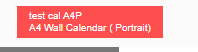
The template name and product name is displayed at the left top corner.
Upload Photos
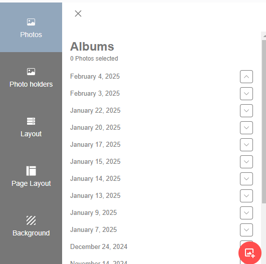
Click on the Photos tab to add your own photos. Supported file type is jpg/jpeg.
PLEASE DO NOT USE CMYK IMAGES, IF they are uploaded they will be converted to normal JPG and it is in this process something can go wrong with the colors and it also depends on the printer's profile.
Photo Holder

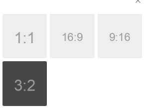
Photo holders: photo holder is a frame for holding the photo. These are predefined ratios for the holders, having square, portrait and landscape orientations.
Image placeholder is a dummy image created in different ratios and orientations for easy and fast designing.
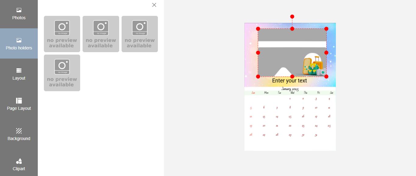
Photo Holders - Click on Photo Holders, and it shows an image holder creator. Now click on it, and it will create an image holder on the designer.
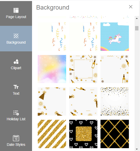
Backgrounds

Backgrounds are images that are placed behind the main photos. These are selected backgrounds we currently offer.
You can add your own backgrounds from the admin section.
The images need to be jpg format.
PLEASE DO NOT USE CMYK IMAGES, IF they are uploaded they will be converted to normal JPG and it is in this process something can go wrong with the colors.
Click on Background, and it shows a list of background images. Click on any background image to apply it to the designer.
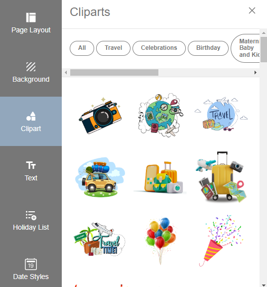
Clipart

Clipart are stickers that can be used to enhance your templates.
You can add your own clipart's from the admin section. The file formats for cliparts are png and are transparent images.
Click on clipart, and it will show a list of clipart. Click on it to apply to the designer.
Text

You can add text, but emojis are currently not supported.
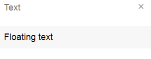
Click on the “Floating text” option to add a text field in the designer.
Click on text to add a text field on the designer.
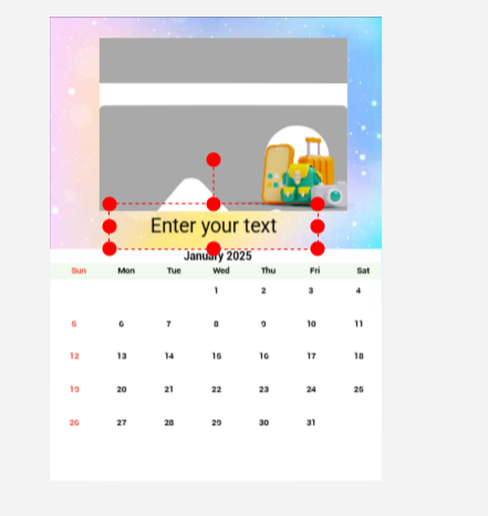
Note - The default label on the text field i.e. 'Enter Your Text' will not be rendered if not edited. Any other text will be rendered and printed on the product.
Example: if a text field is added and no editing is done for it, then it will not get rendered.
Text Options: Template Creator has standard text options like “Locking/Unlocking” the text box, “Move Forward/Backward” option to move the textbox as desired, “Delete” option to delete the textbox, font style & size selection, font alignment option, Bold/Italics option and also the text color/text background color option.

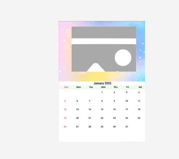
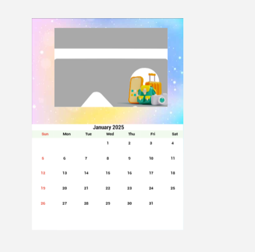
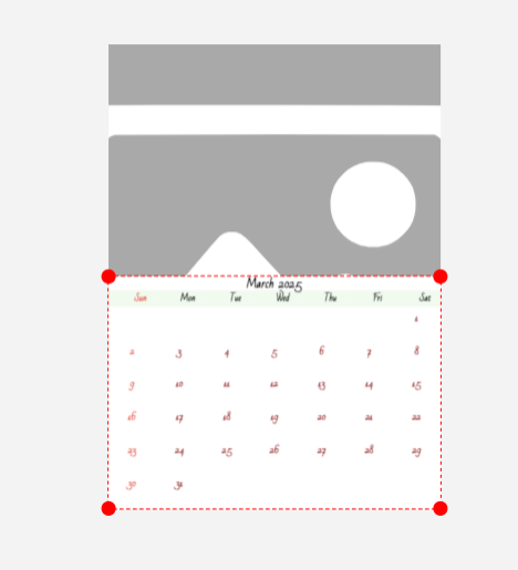
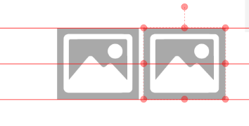
The Center part of the designer is a work area.
The work area will contain an image holder and date pad displayed when the designer is invoked for the first time.
The red dots on the image are the handles that can be used to resize the image and date pad as required.
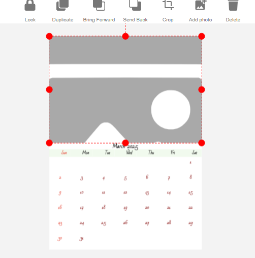
Toolbar for Photo Editing
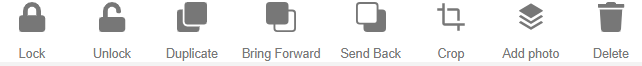
- Lock/Unlock: this feature allows the user to lock/unlock any object in the design area.
- Duplicate: Duplicate allows you to copy a selected photo.
- Bring Forward: Photos or text can be arranged one above the other using the Bring Forward button.
- Send Back: Works similar to Bring Forward and sends the photo/text holder behind.
- Crop: use Crop to edit a photo, you can crop a portion and remove unnecessary parts of the photo.
- Add Photo: Allow to add a photo holder. You can select and drop an image on it.
- Delete: Delete the selected photo holder.
Text Editing Tools
- Duplicate: Duplicate allows you to copy a selected photo.
- Font and size: Select the font and size for the text required. Currently, we have set a few pre-selected fonts. Fonts can be enabled from the admin section.
- Font Text Color & Background: Select the text color and background. The current version allows only pre-set colors.
- Text alignment can be done using the above tool.
- Text can be changed to bold or italic by toggling these buttons.
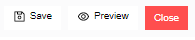
- Click on Save to save the designed template.
- Click on Preview to view the template on the product, currently only 2D preview is available.
- Close will close the template and redirect back to the admin website.
Gridlines
Gridlines are provided to align two or more photos.
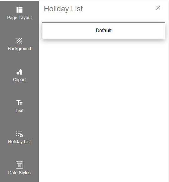
Holiday List
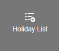
You can view a list of fixed and non-fixed holidays.
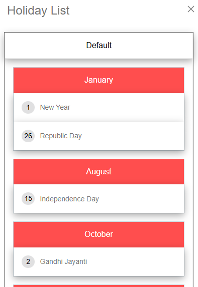
The default list will display all fixed holidays.
Default (Fixed Holidays): Fixed holidays fall on the same date every year like New Year, Independence Day etc.
Non-Fixed Holidays: Non-fixed or movable holidays do not have a set date each year. Examples include: Holi, Diwali etc.
Click on default to view all fixed/ default holiday list.
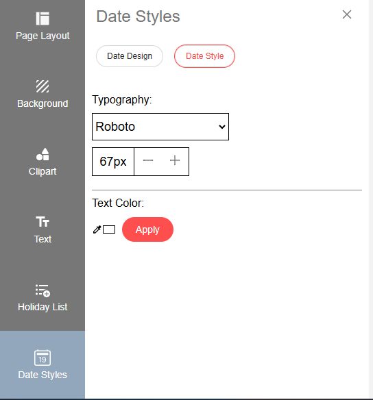
Date Style
- It includes all the options to modify the date pad style, such as date pad design, font, and text color.
- Date Design: A Date Pad Style is the way dates and weekday names are displayed in calendars. You can select your predefined date pad style.
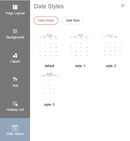
- Date Style: You can modify the date pad style by selecting the font style, font size, and text color.
- This feature allows users to dynamically modify the dimensions to fit different designs or user preferences.
- This feature allows users to dynamically modify the dimensions of the date pad by adjusting the width and height according to their requirements.
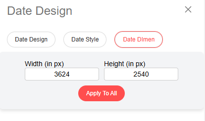
- NOTE - The set width and height will be applied to the date pad across all pages.
Typography:
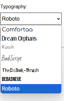
- You can select your preferred font for the date pad by clicking on the dropdown button and choosing a font style.
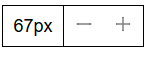
- You can adjust the font size by clicking on the “+” and “-” buttons.
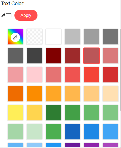
- Click on the color picker to display all the available color options. Select any color and click the Apply button. This option allows you to change only the color of the dates on the date pad.
- Choose all your preferred options and click the Apply button. The date pad for all months will be updated according to your selection.

Need Help?
If you're stuck, don’t worry — just email us at support@ezycreate.com or send your thoughts to feedback@ezycreate.com.